
4-1Figma + Google Fonts
📌 Complete before class
- 📚 Module 3.1 Design with Figma (91–98)
- How to wireframe | Figma (2019)
- Codecademy: CSS 3-2 Changing the Box Model (5)
- Codecademy: JS 1-1 Introduction to Javascript (8)
👉 Activity: Reimagine a Brand’s Message
Section titled “👉 Activity: Reimagine a Brand’s Message”Draw a wireframe and create mock-ups in Figma that subvert a corporation’s messaging using their colors, typography, images, and/or language.
- In the Unbranding moodboard you created in Figma, create a new Desktop frame for a first version of your design.
- Reimagine the messaging of a brand’s identity to provide your own alternative commentary. Consider: Who is your audience? What do you want them to think about when they see your updated, subversive design?
- You may want to begin by making a screenshot of the original design and placing it in your composition. Some people like to layer new work on top of the original, thus imagining the original as a template.
- After you have a rough idea, duplicate the frame and create a new iteration. Remember that your final web page will include a hover effect during which a page element (an image or text) changes when the user hovers their mouse on top. So make a before and after showing both states.
👉 Activity: Choose or Matching a Typeface
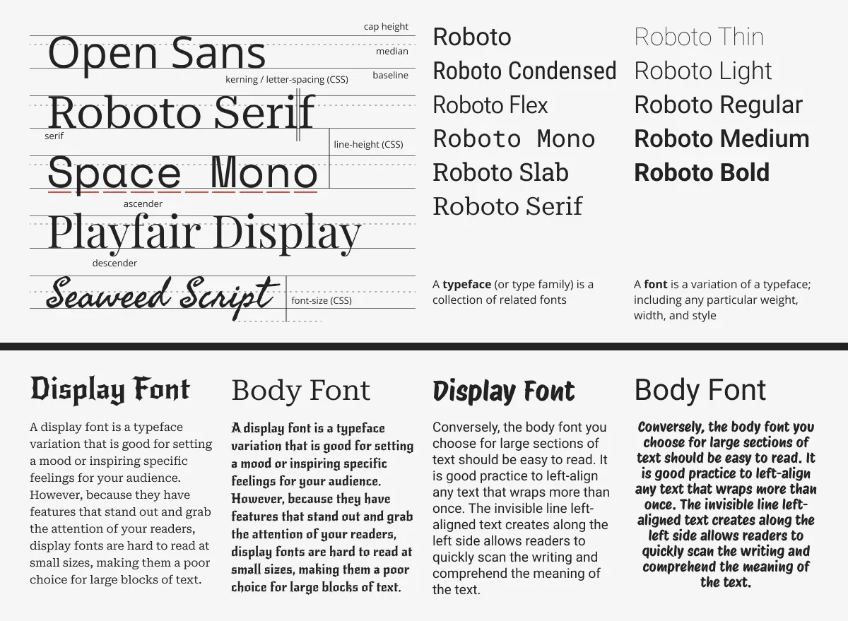
Section titled “👉 Activity: Choose or Matching a Typeface”Much of the time, when selecting a typeface for your web project, you will start by looking at Google Fonts, fonts.google.com.
- Browse by categories, filter for serif or sans-serif fonts, and preview the font in whatever text you type into the box.
- Once you find a font for your project, click to see its specimen page.
- Beneath the preview area, select the font by pressing the Select button (the plus) on the right side of the preview. The Selected family menu appears on the right side of the browser. If it doesn’t appear then click on the icon on the top right of the window.
- You should select several fonts and display them together so you can make a visual comparison.
For our project, we wanted to find a typeface matching the IKEA identity. We started with a search on Google for “IKEA logo font.” Often organizations will start with a particular font and modify it to make it hard to copy or better match their identity. Identities also evolve, as you will find with IKEA. We chose the font Jost.
👉 Get Feedback and Start Coding
Section titled “👉 Get Feedback and Start Coding”Critique — “I Notice / I Wonder” With 15 min remaining, pair up and share work on screen. Each partner gives feedback using only: “I notice ___” and “I wonder ___.” No praise, no criticism — just observing and questioning.
Start coding by forking this repo: Unbranding
📌 Homework
- 📌Unbranding
- 📚 Module 3.2 File Paths, Images, and Pseudo-Classes (99-111)
- 📚 Module 3.3 Web Fonts & JavaScript Events (112-117)